-
The challenge
A spa and wellness brand wanted to feel calm, pure and premium at first glance.
-
Our approach
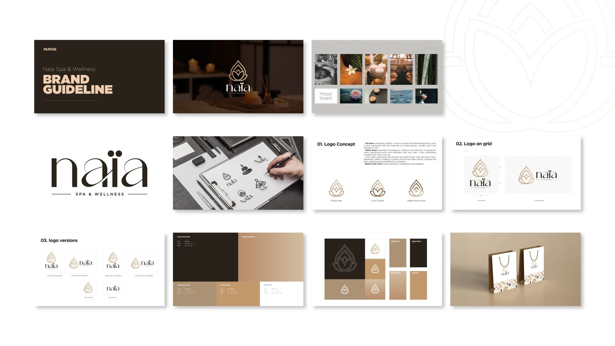
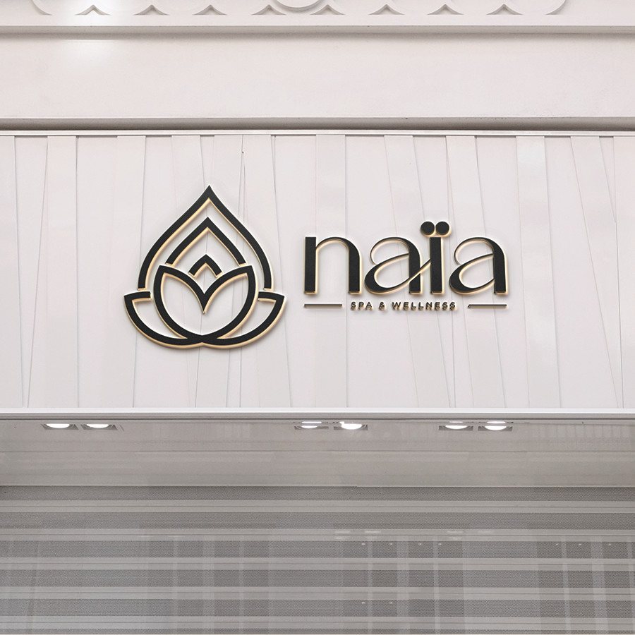
A mark that is a water drop and a lotus at once, drawn in fine gold lines; sandy browns and deep umber for a warm, natural feel.
-
The outcome
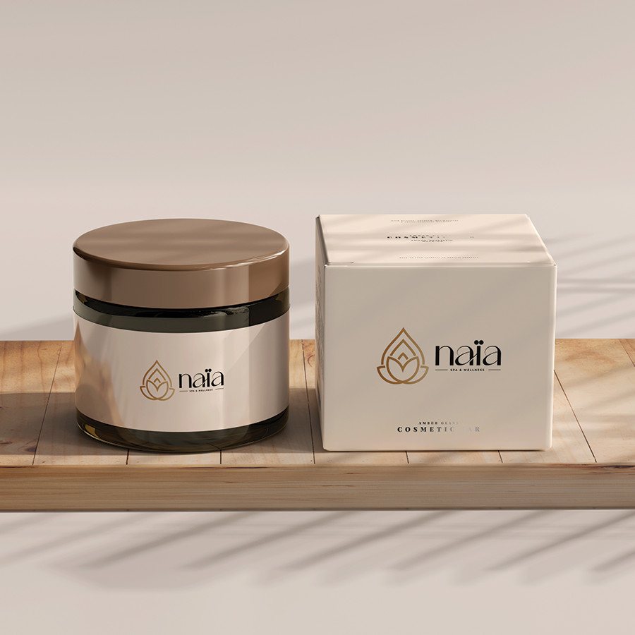
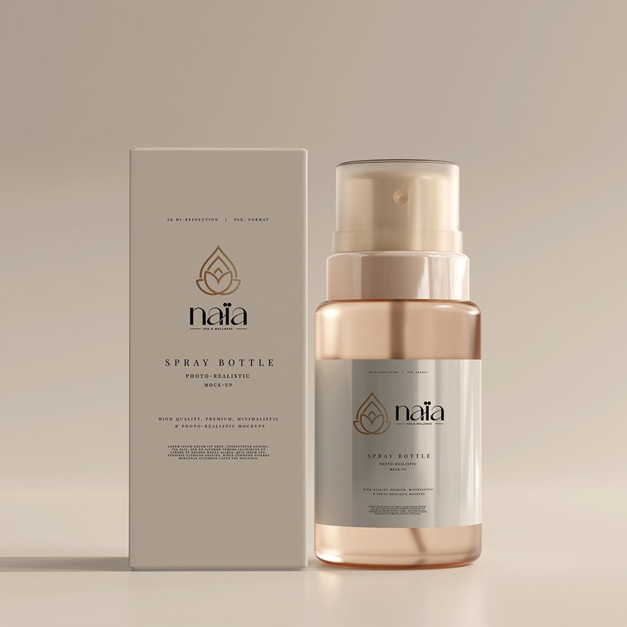
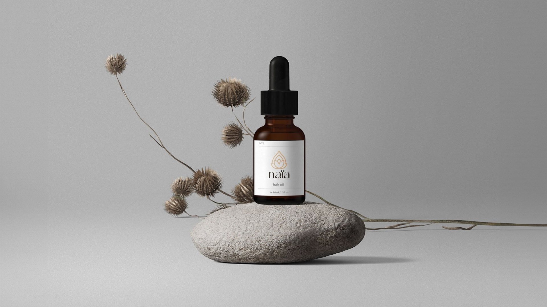
One identity from the logo to name cards, packaging and the spa’s own walls.
A drop becomes a lotus
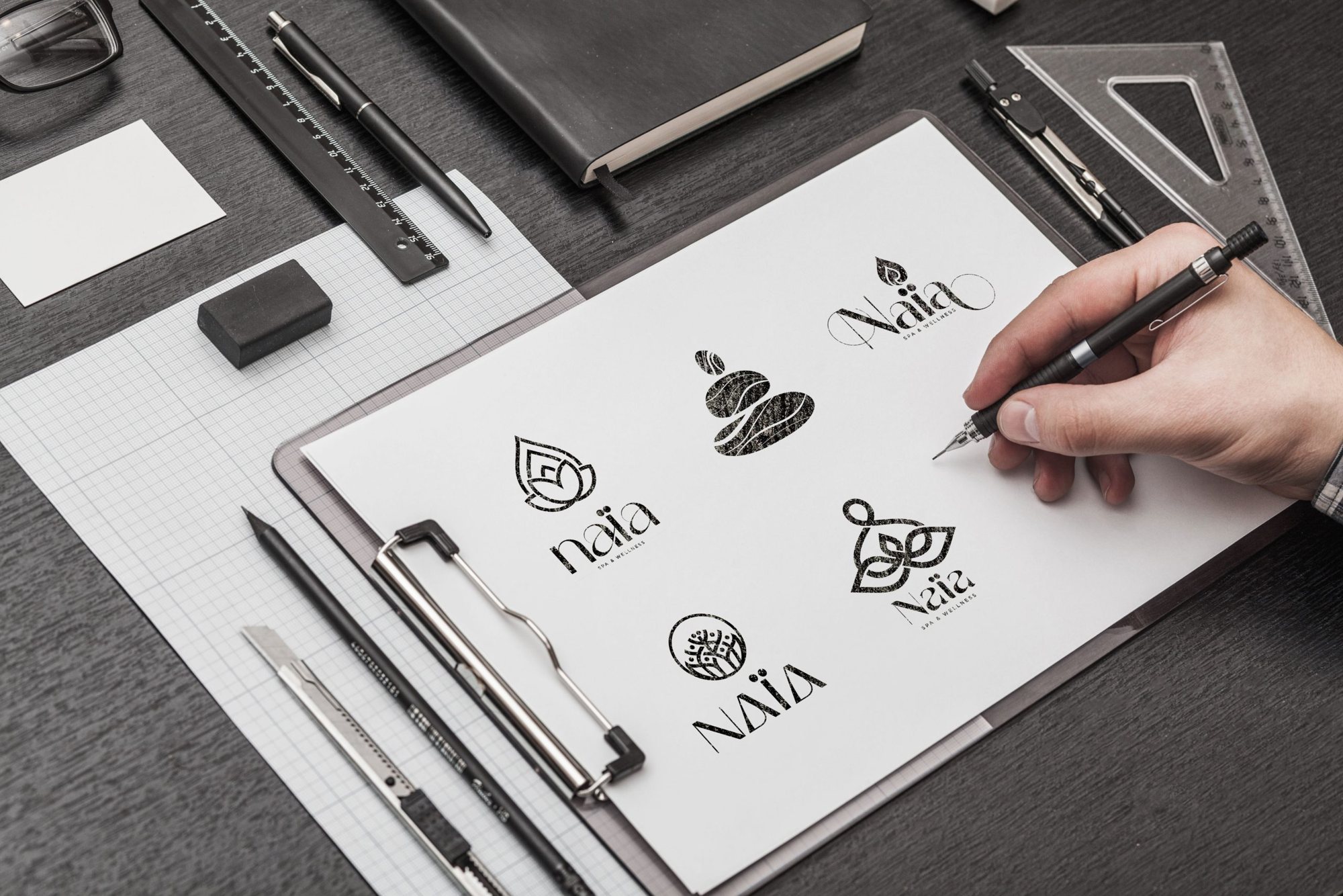
From sketch to mark
It started on paper: a drop of water, a lotus opening. The lines that stayed became the mark.
Sandy brown
#AB9274
Umber brown
#282119
Gradient sand
#CEB798
Tan brown
#C2996D
01. Where it lives
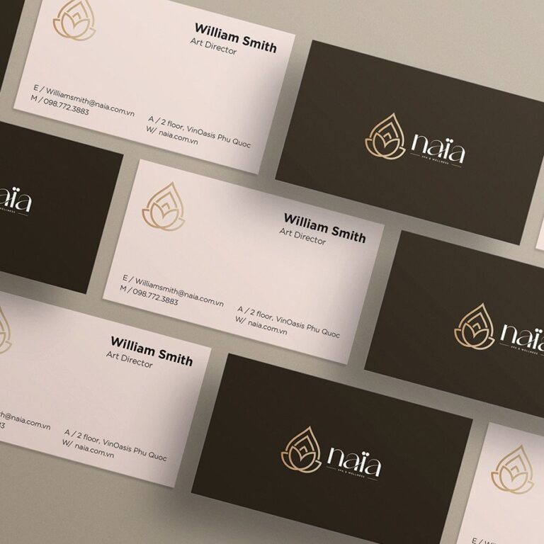
Name cards
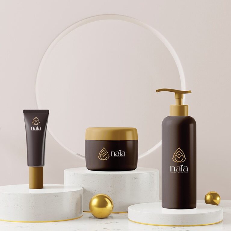
Packaging
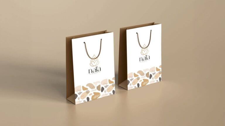
Bags