-
The challenge
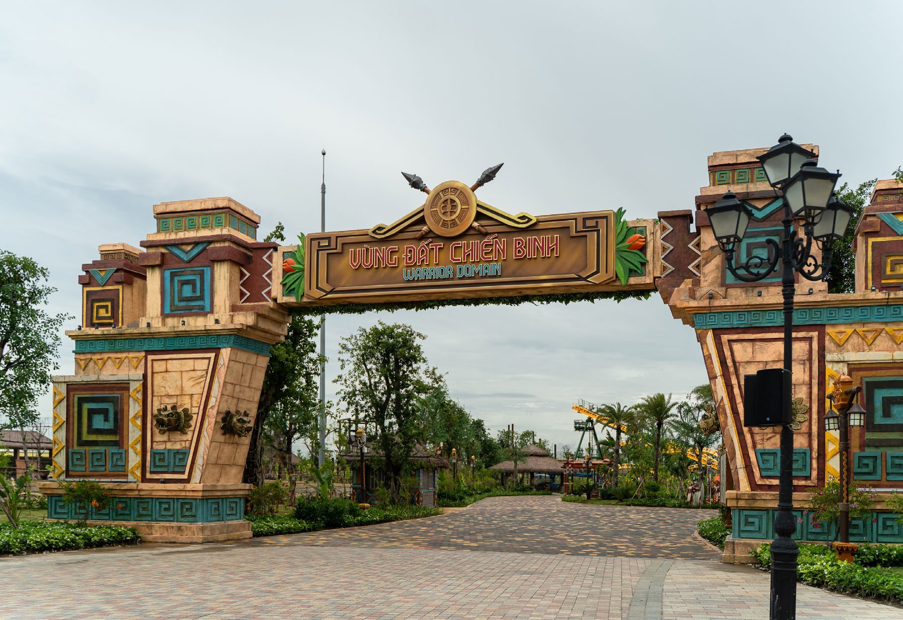
A theme park built on myths and adventure needs signs that feel like part of the story — and still get every visitor, of every age, where they’re going. Outdoors, all year round.
-
Our approach
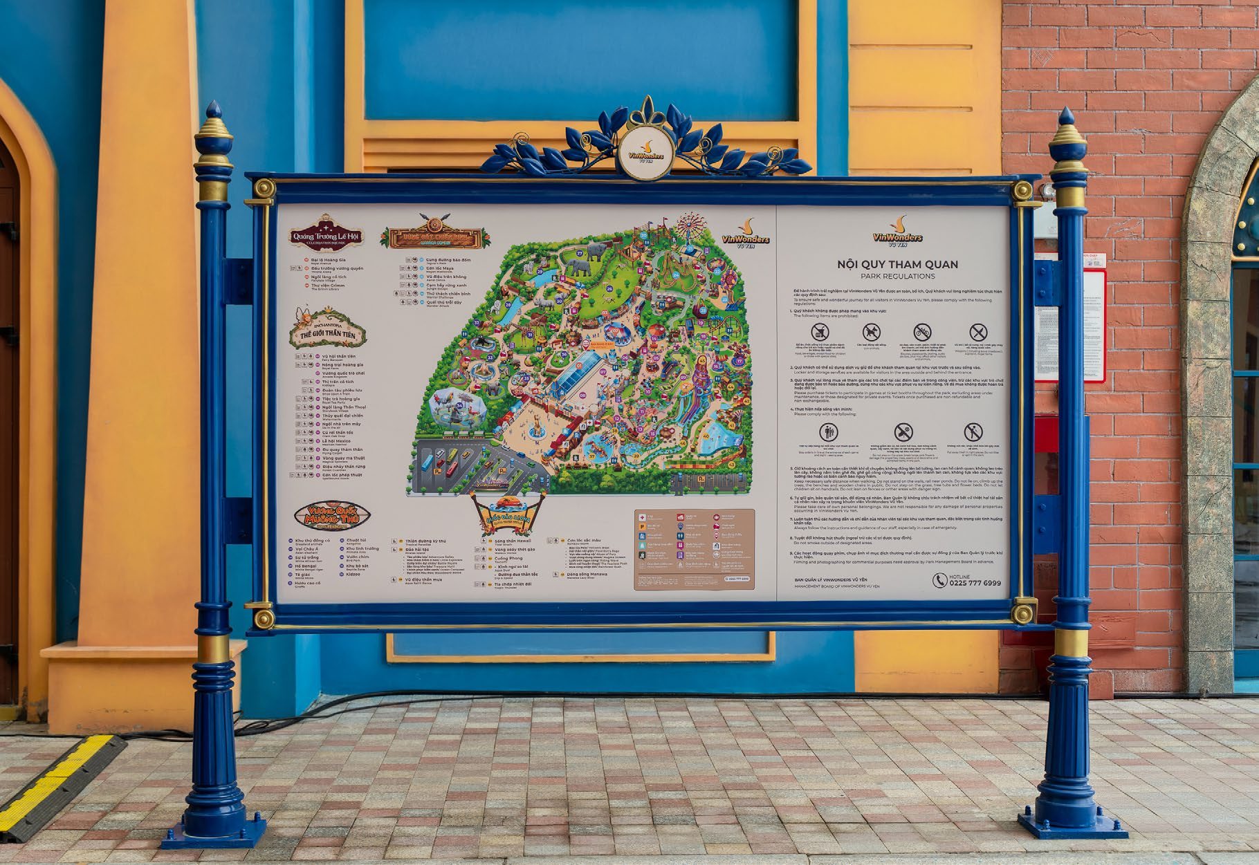
One visual language across the park: fairytale architecture, faux wood and wrought metal. Maps, icons, type and colours all speak it, and every sign is drawn to real build proportions.
-
The outcome
From the gate to the smallest toilet sign, one system that guides people and adds to the adventure — built to last in sun, rain and crowds.
- 4 sign types in one family
- 2.5 m tallest direction post
- 2 languages on every sign
- 1 visual language, whole park
Entrance gates · Park maps · Direction posts · Rules boards · Height gauges
01. One park, one language
Every zone has its own look — fairytale town, jungle tribe, warrior lands — but the signs work the same everywhere.
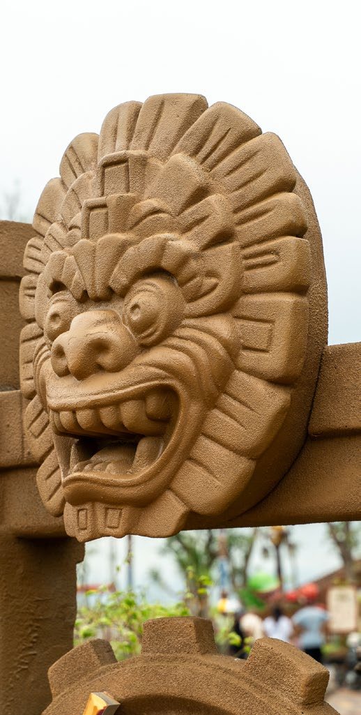
Built for the story
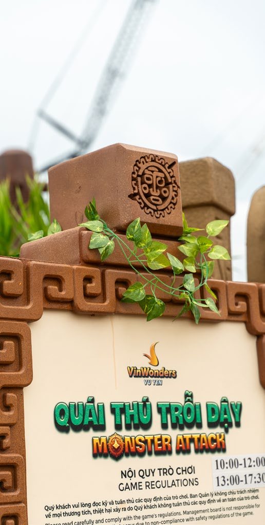
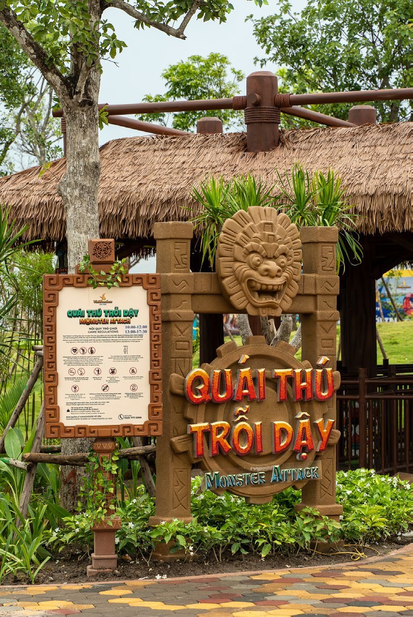
Carved masks, faux timber, wrought-iron posts: each sign looks like it grew out of its zone, so it feels like part of the ride — not a notice stuck on top of it.
02. Drawn to real size
Every sign type drawn in millimetres, next to a person, before anything is built.
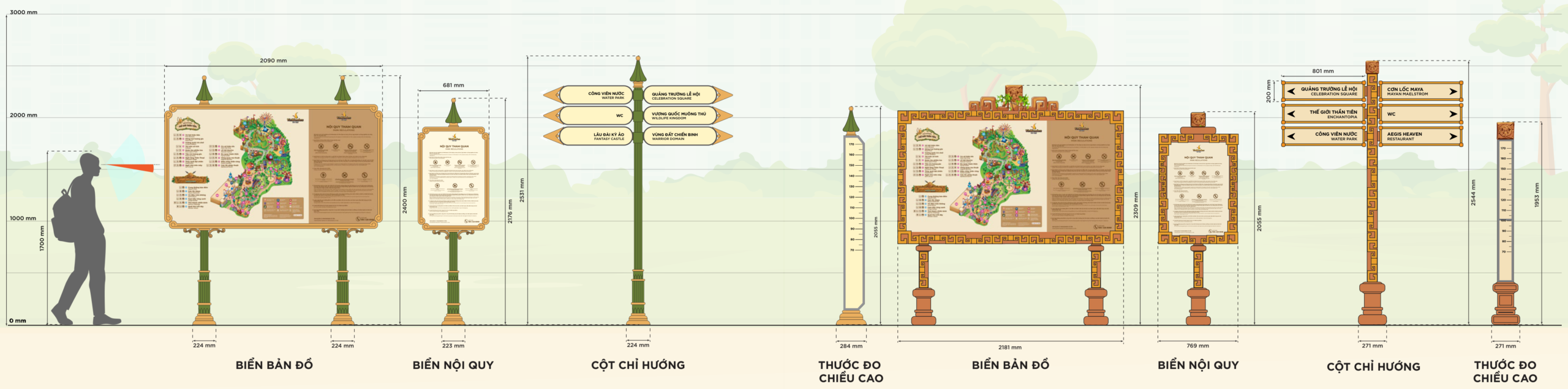
Drawn vs built
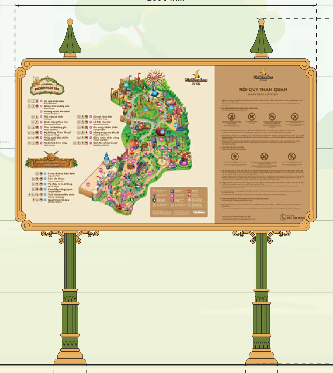
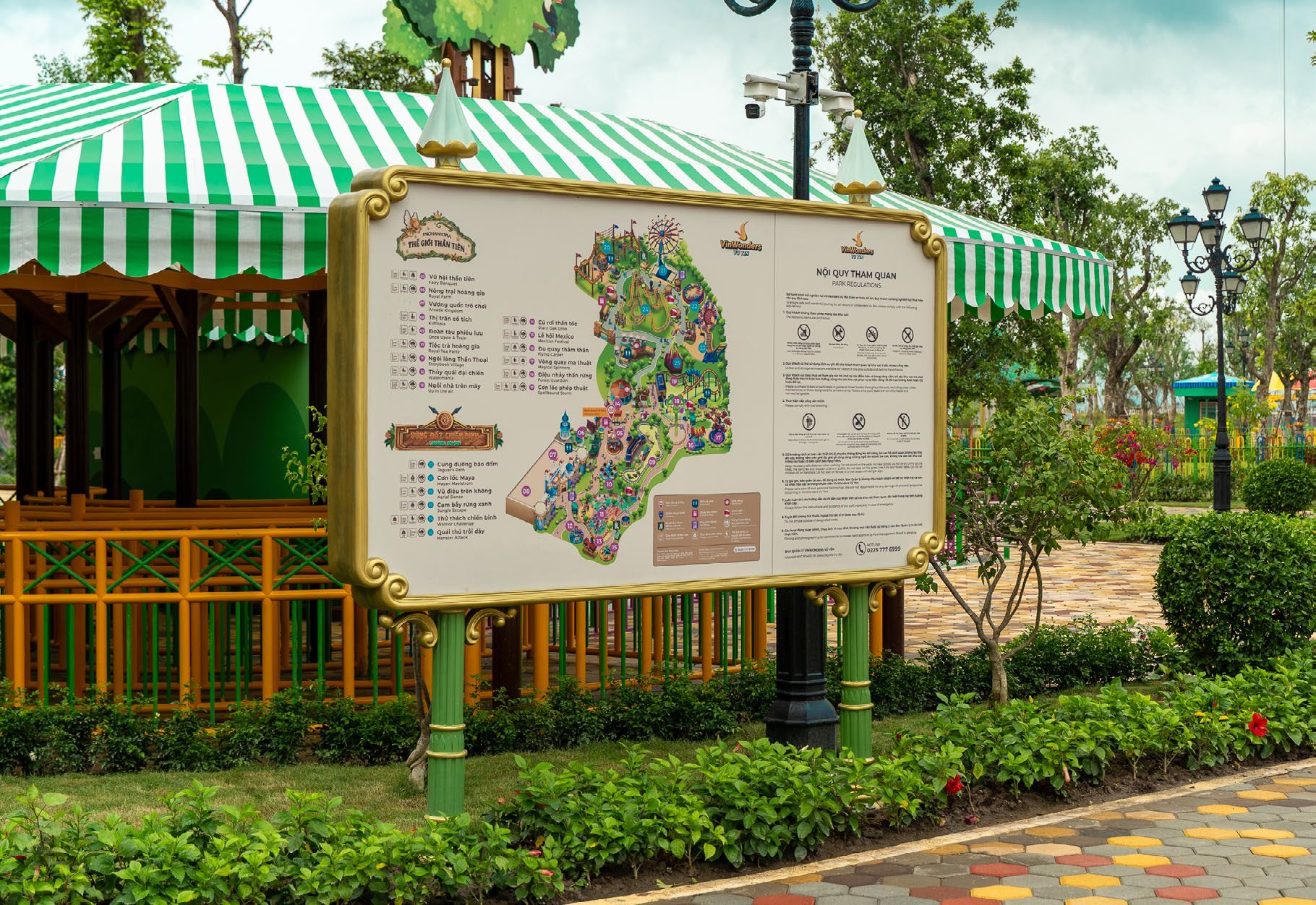
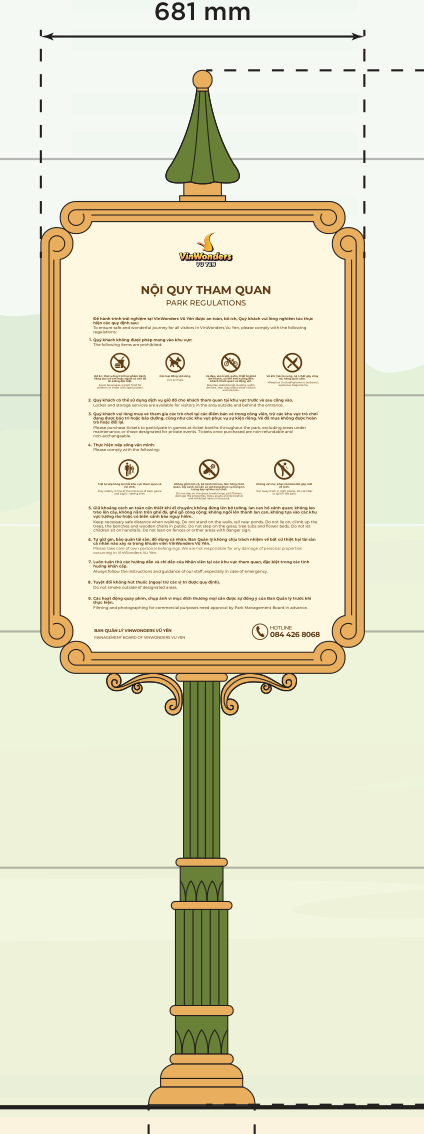
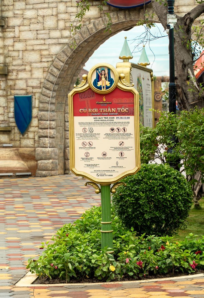
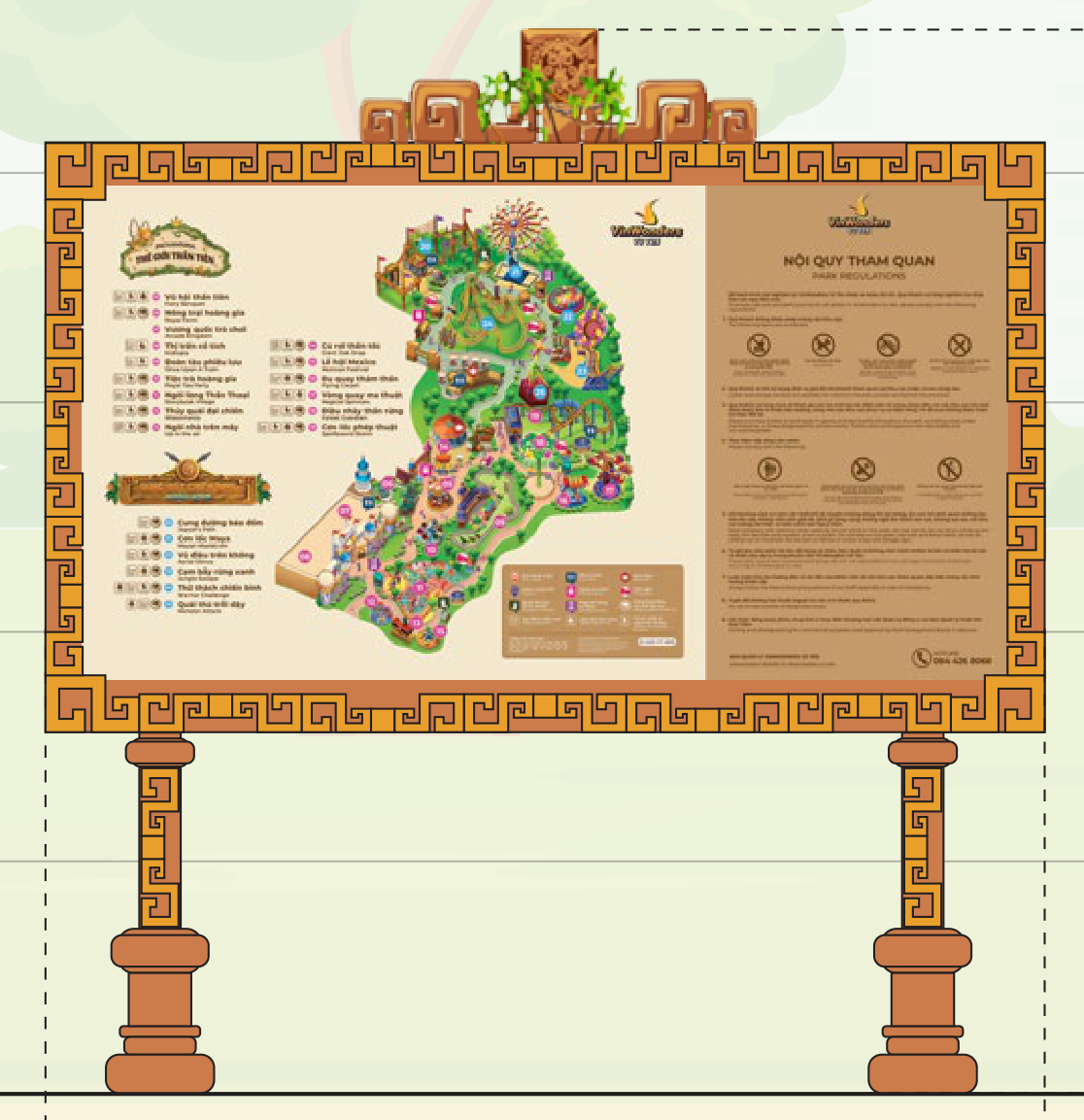
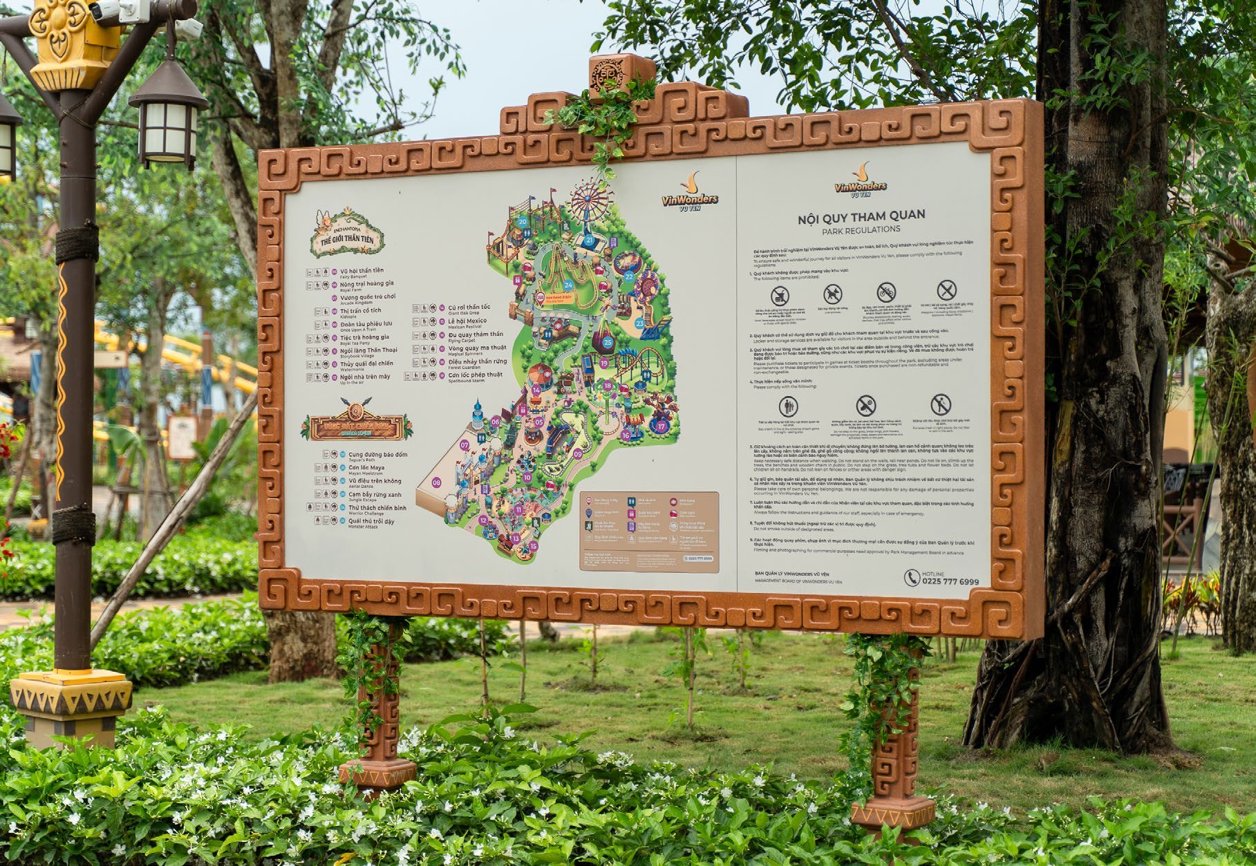
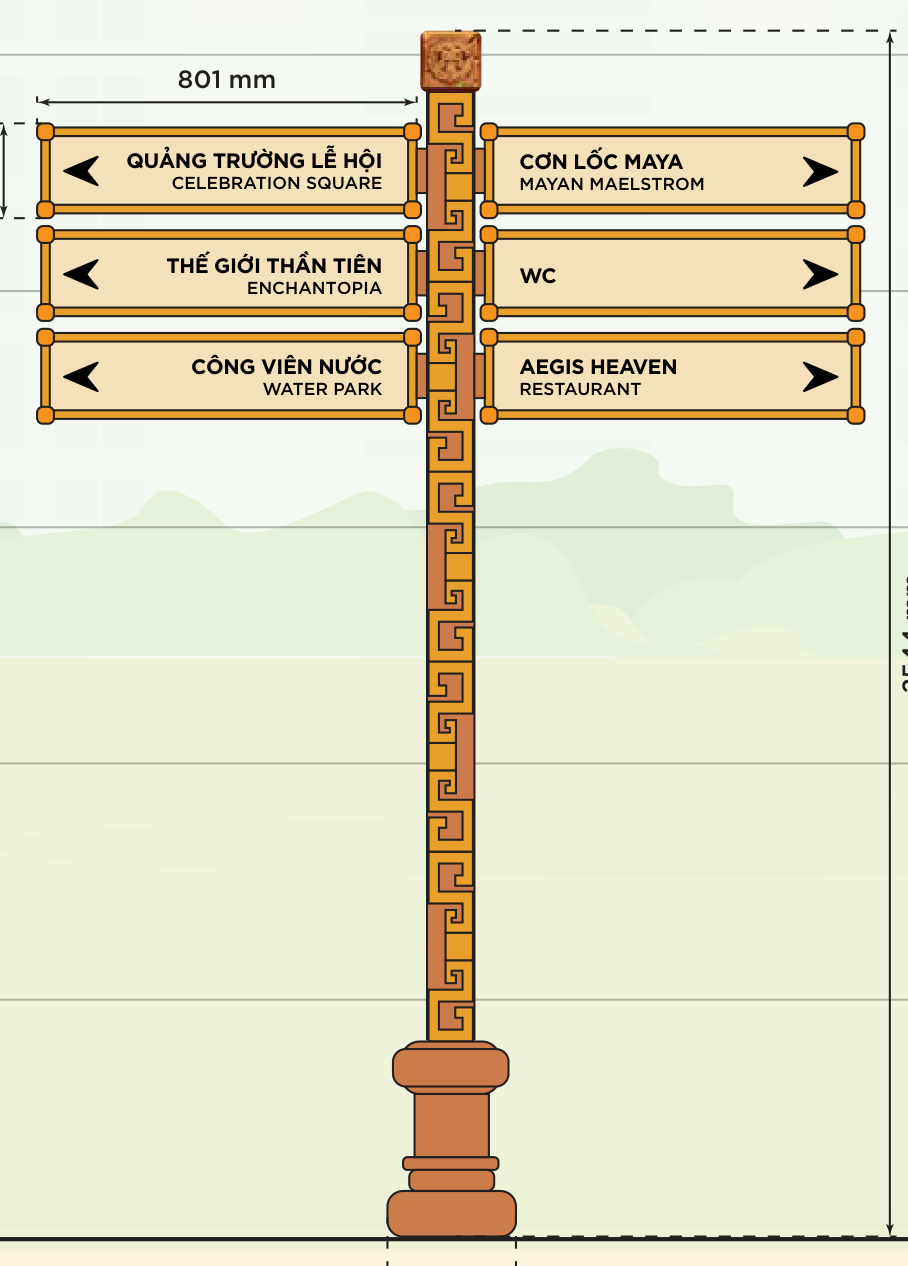
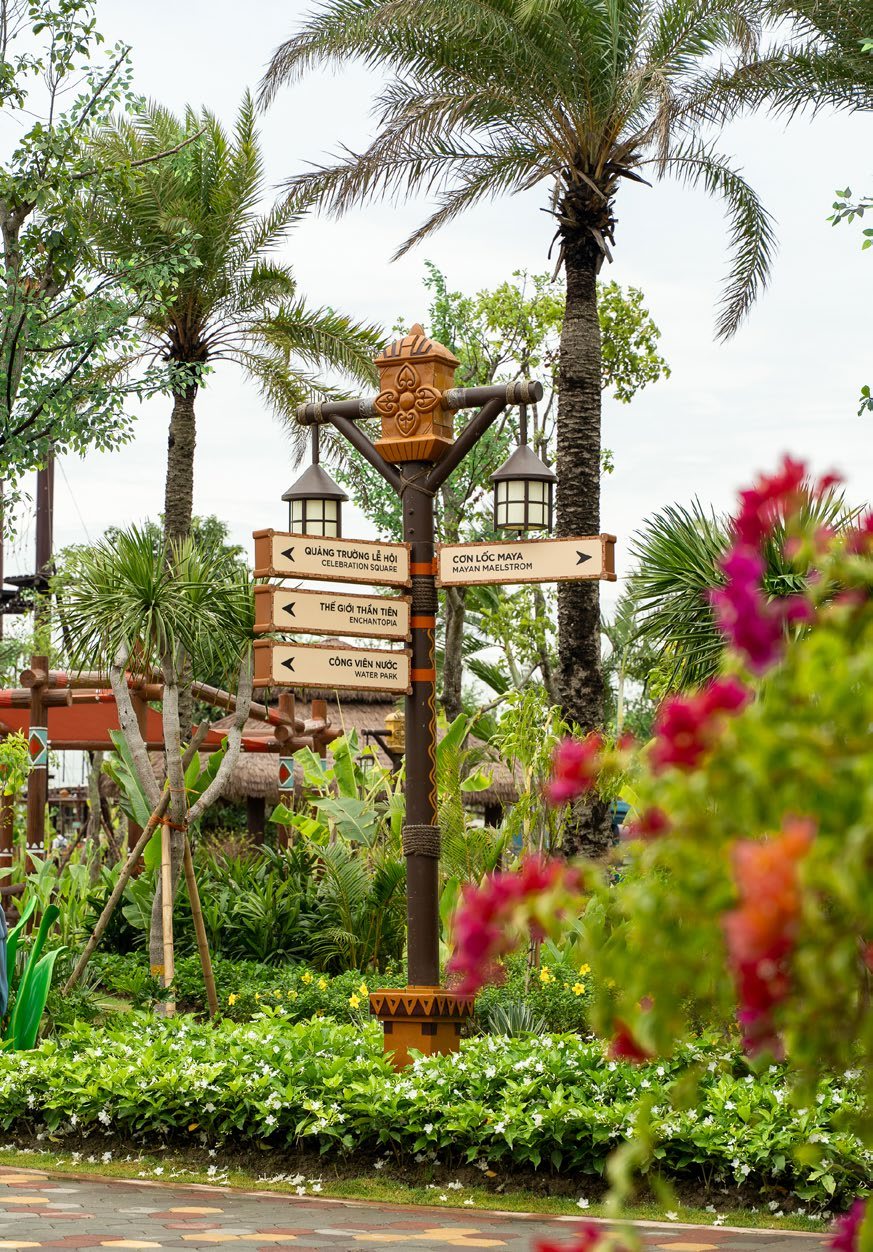
Drag the red handle to compare.
03. Out in the park
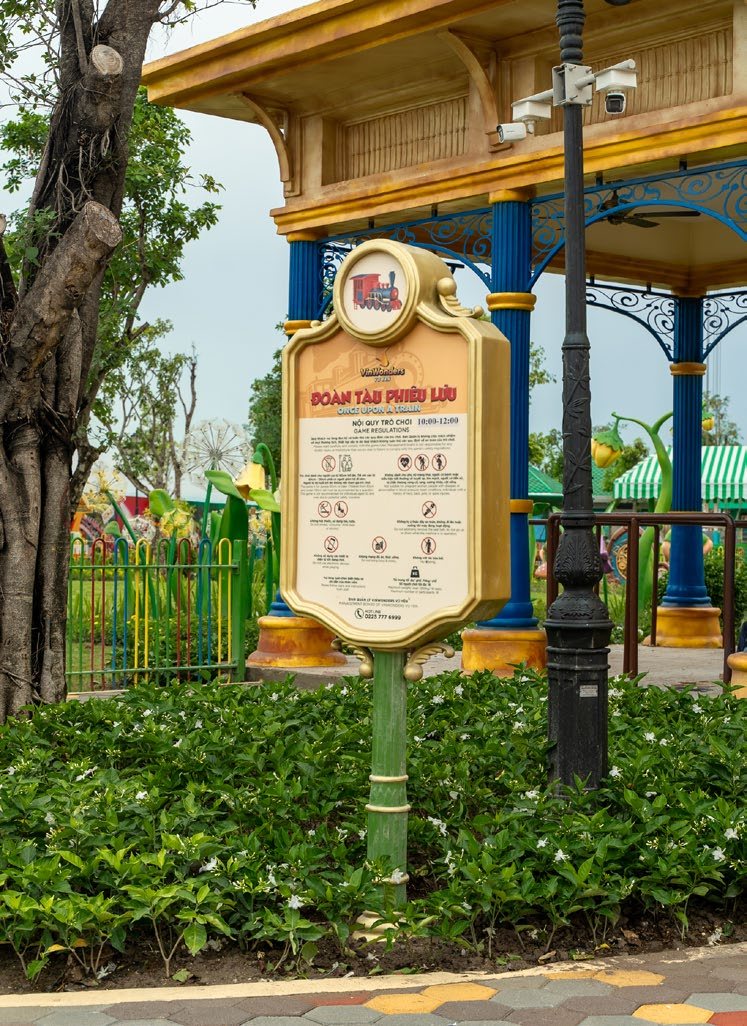
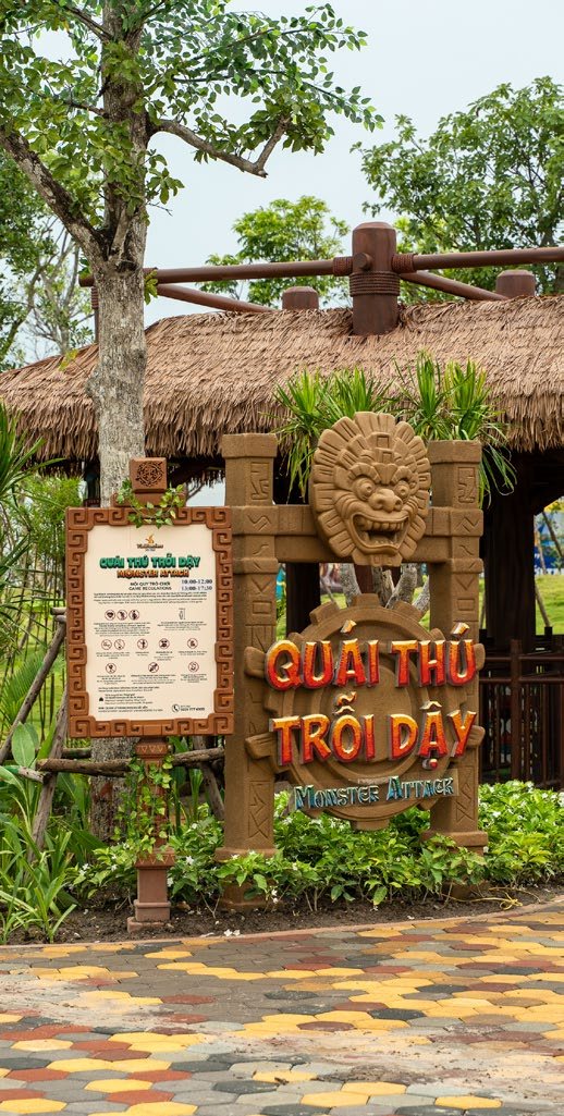
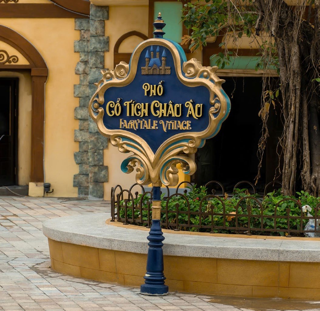
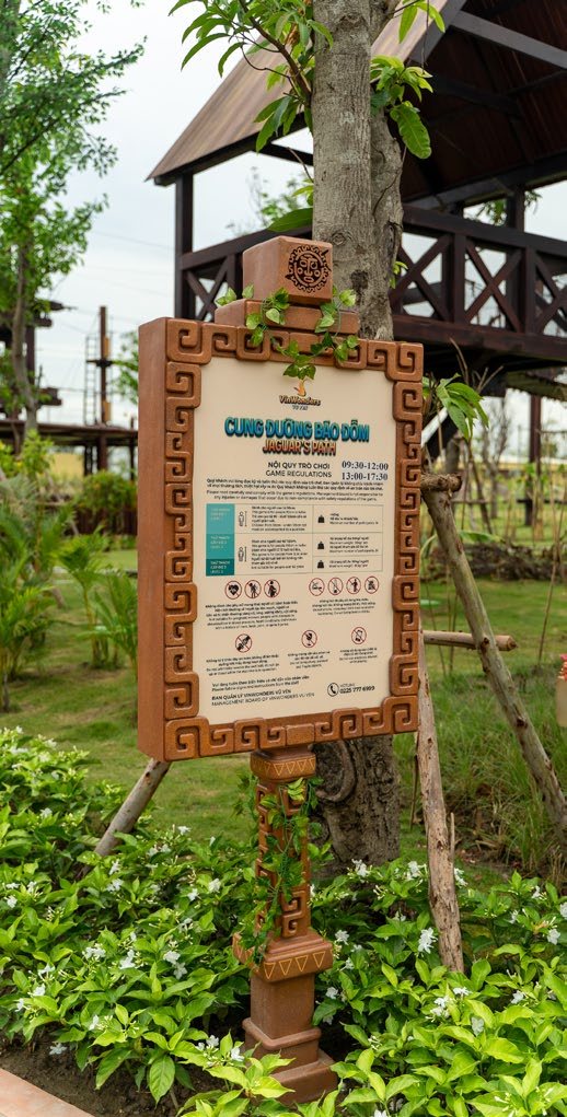
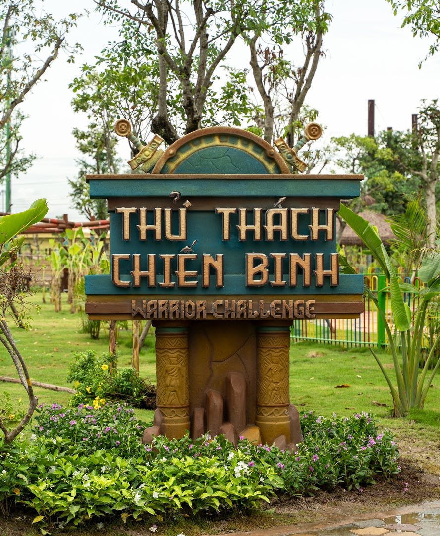
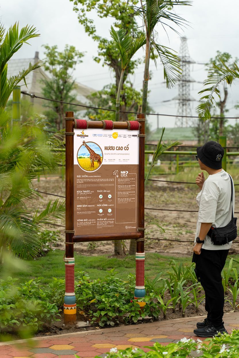
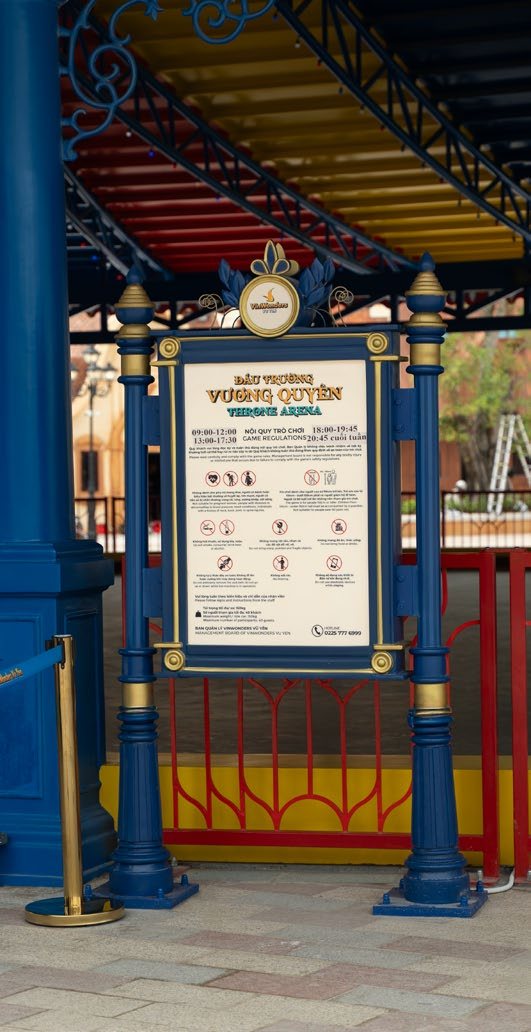
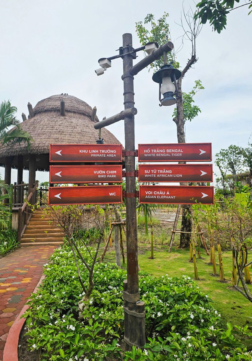
The bros on this
- Lan Ha Wayfinding design
- Linh Mac Creative lead
- Duc Ngo Graphic design