-
The challenge
A fine-dining restaurant inspired by land (Terra) and sea (Mare) needed a brand as balanced as its kitchen.
-
Our approach
Flowing lines that read as waves and as layers of earth, in one calm mark. Deep navy with a silver shimmer: luxurious, a little mysterious.
-
The outcome
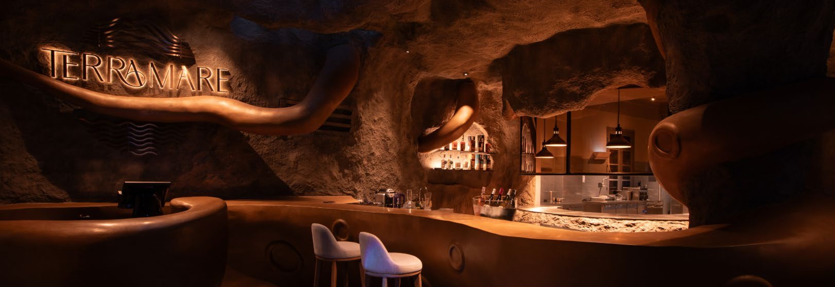
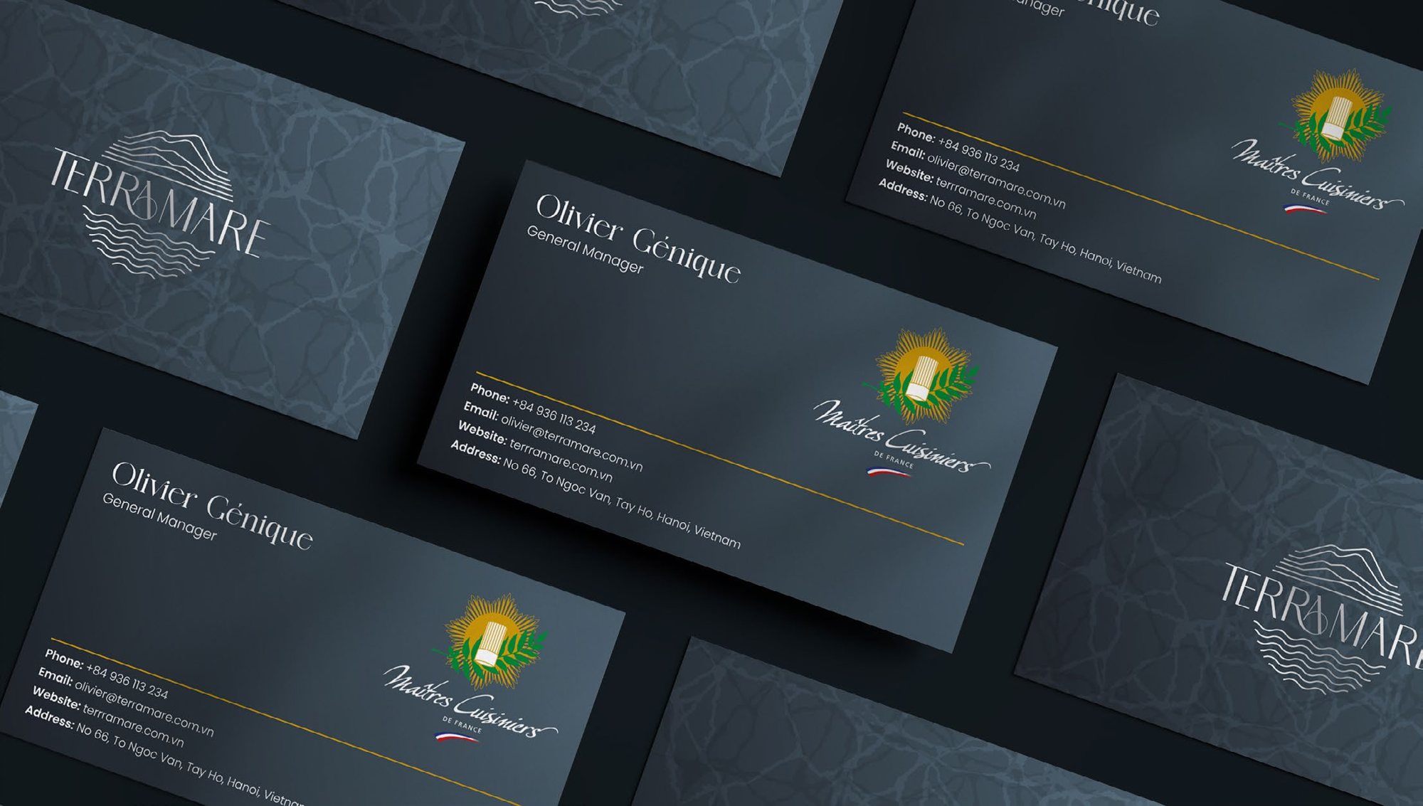
One identity across name cards, envelopes, menus and the dining room itself — so the whole evening feels like the same place.
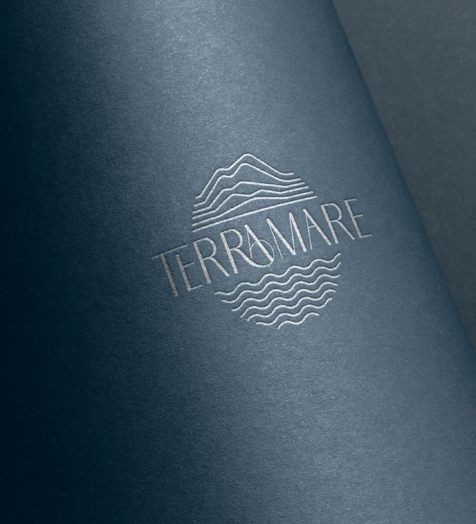
Waves and earth, one mark
The logo’s lines move like sea waves and stack like layers of soil — elegant at a glance, with depth when you look again.
- 5 touchpoints, one identity
- 3 brand colours
- 1 mark: land + sea
Deep sea
#081E2D
Navy slate
#344551
Silver shimmer
#C7CCD1
01. Everywhere guests look

Name cards
Embossed mark, silver foil.

Grand opening
Invitations in the same navy.
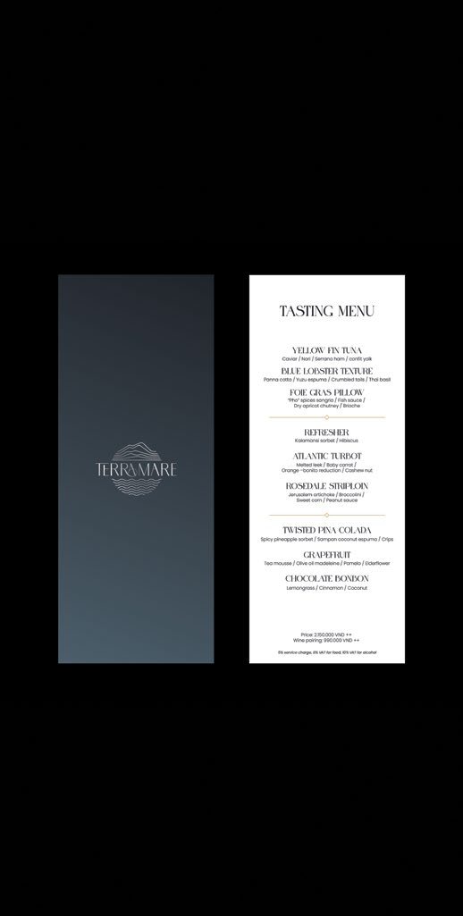
Tasting menu
Quiet type, lots of air.