-
The challenge
A boutique hotel built on craft and classic detail wanted a brand that feels hand-made, premium and rooted in culture.
-
Our approach
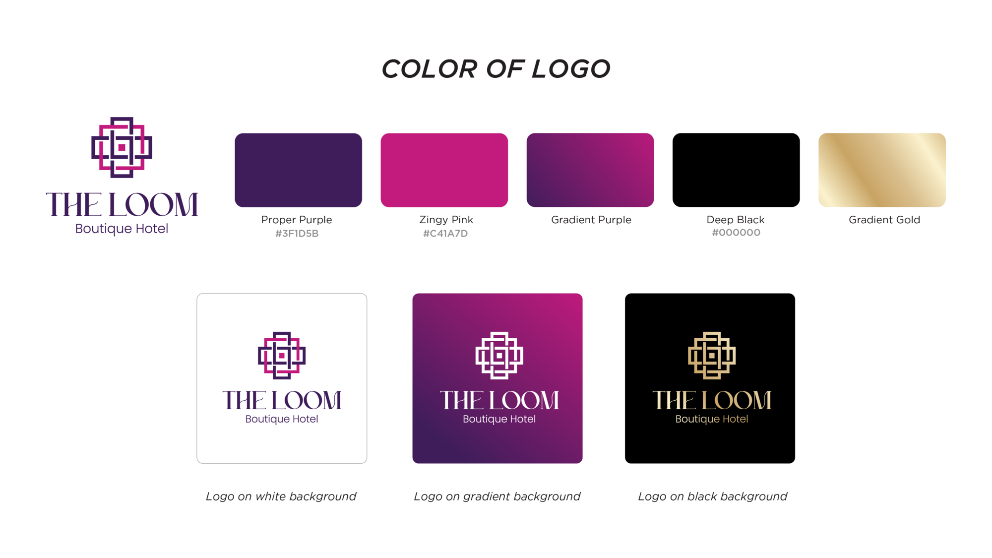
A mark woven from interlocking lines — the frame of a loom, the craft of weaving — with a slim, elegant typeface. Deep purple for classic charm that still feels modern.
-
The outcome
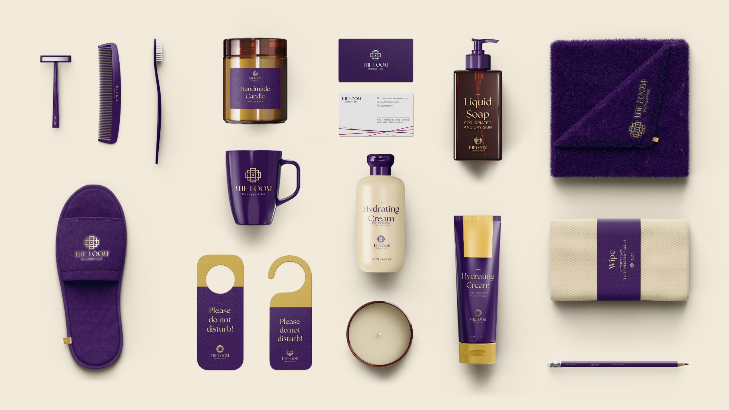
One identity on signs, room amenities, menu covers and door hangers, so a stay feels woven together from check-in to check-out.
The mark, woven
The logo animation: the loom wheel turns, the threads weave the mark.
-
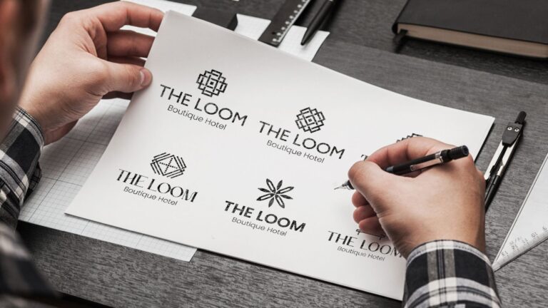
Sketch
Dozens of pencil marks before one felt right.
-
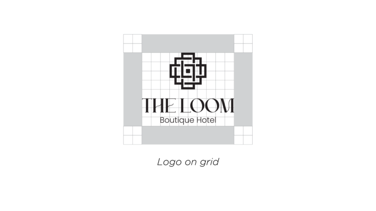
Grid
Every line on a square grid, like threads on a loom.
-
Final
The woven mark with a slim, elegant name.
01. Woven into every stay
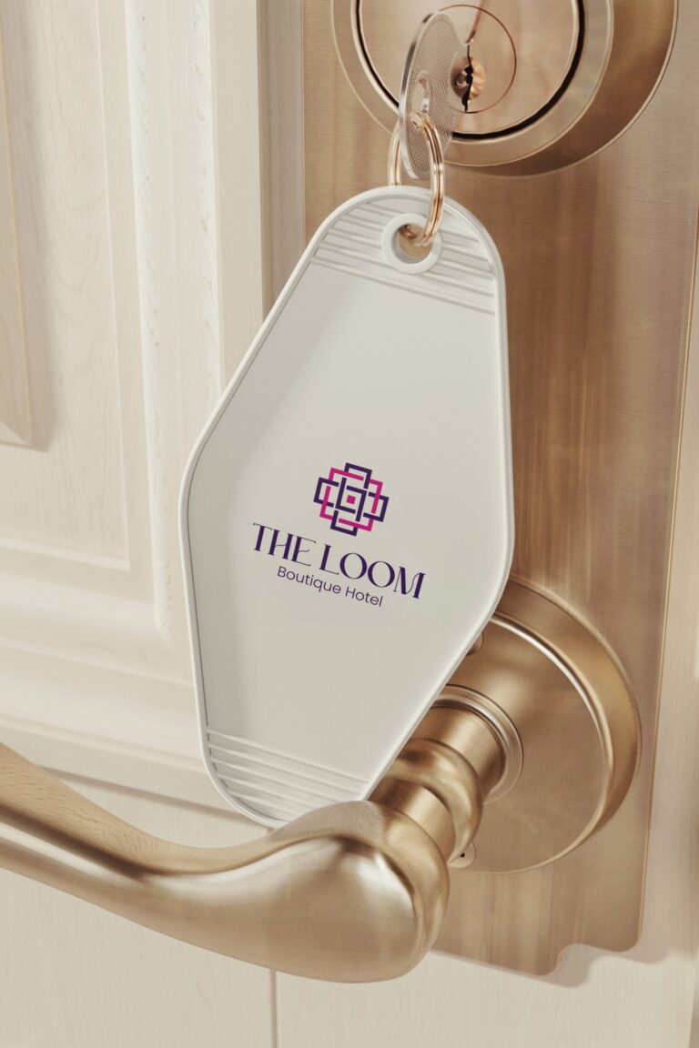
Key tag
The first thing guests hold.
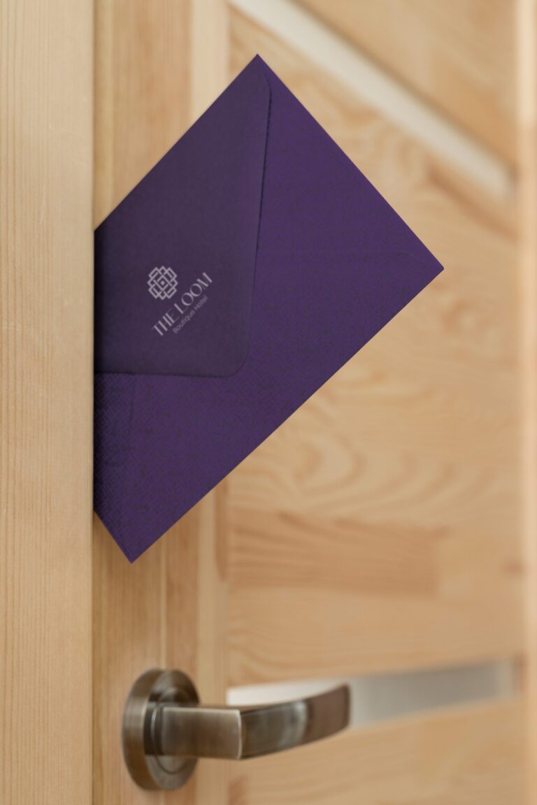
Envelope
Deep purple, silver mark.
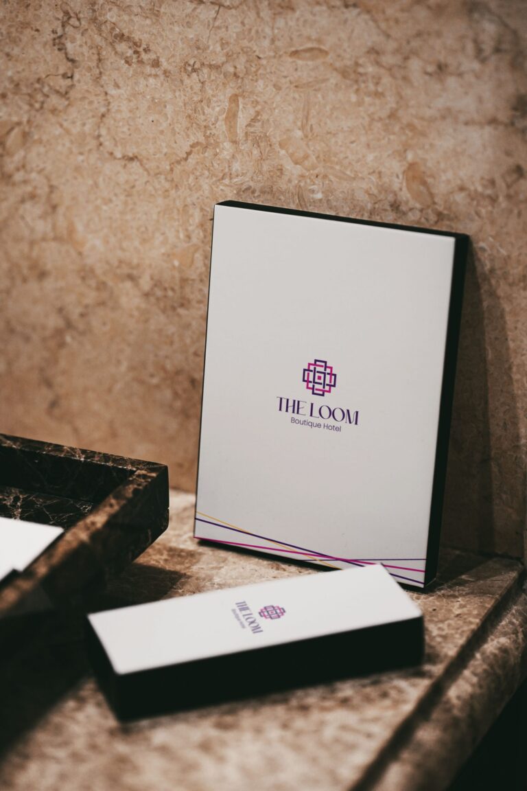
Stationery
Clean white with an orchid edge.
02. The guidelines
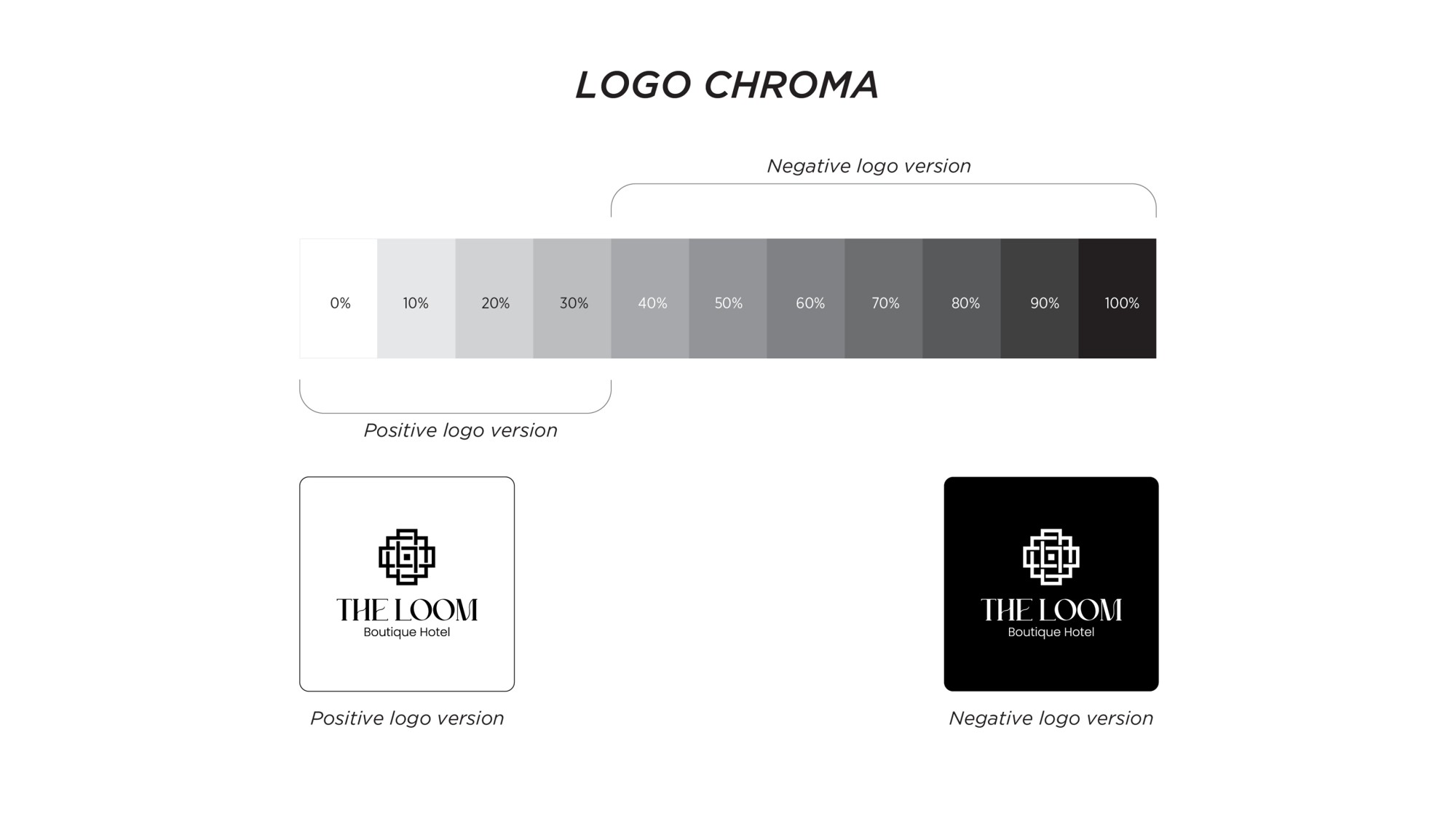
How the mark is built and used — versions, clear space, colours.